Shopify Store Rebuild for a Home Decor Brand
A filterable catalogue, a product page that answers the questions buyers actually ask, and a checkout with the duplicate steps taken out.
- 2.4x growth in traffic
- +68% growth in business
- -64% mobile page weight
- 4x campaign pages shipped

The challenge
The brand had outgrown the theme it launched on. Three years of new categories, seasonal collections and one-off landing pages had been bolted onto a template that was never designed to carry them. Collection pages ran to hundreds of products with no way to narrow them down, product pages buried the details buyers actually needed, and the checkout asked for information twice.
The result was a store that looked busy but converted poorly on mobile, where most of the traffic was arriving. Page weight had crept past four megabytes on key templates, and the team could not launch a campaign page without a developer.
What we did
Rebuilt the catalogue around how people actually shop
We restructured the collection hierarchy around rooms and use cases rather than internal product taxonomy, then added faceted filtering for size, material, colour and price. Every filter state gets its own crawlable URL, so the long-tail category pages can rank on their own.
Rewrote the product page as a decision tool
Dimensions, materials, care instructions, delivery windows and returns now sit above the fold in a tabbed block instead of at the bottom of a wall of copy. Gallery images load progressively, and the variant picker updates price, availability and delivery estimate without a page reload.
Cut the checkout down to what is necessary
We removed the duplicate address step, added express payment options at the top of the cart, and made shipping cost visible before the customer commits to an account.
Handed the team the keys
Campaign pages, homepage sections and category banners are all editable sections now. The marketing team ships a new landing page without opening a support ticket.
The results
The rebuild shipped in phases so the store never went dark. Mobile page weight came down by roughly two thirds, the catalogue became fully filterable, and the team moved from one campaign page a month to one a week.
What we used
- Shopify 2.0 sections and metafields
- Custom Liquid theme, no page-builder dependency
- Faceted search with crawlable filter URLs
- Structured data for products, breadcrumbs and FAQs
- Core Web Vitals budget enforced in CI
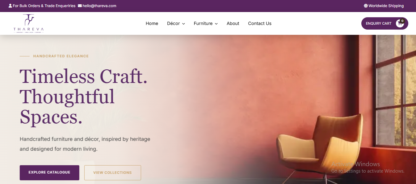
Screenshots


More case studies
SEO Landing Page System
A reusable landing-page structure for city and campaign pages, with FAQ schema, internal links and one focused conversion…
Read the case study Ecommerce store buildEcommerce Website Experience
Product browsing, category clarity and product-page trust rebuilt around how buyers actually shop, through to a calmer checkout.
Read the case study Website redesignLocal Service Website Redesign
Cleaner page hierarchy, mobile-first sections and SEO-ready FAQs, with call and enquiry actions on every screen.
Read the case study